Accessible Fonts and Typography for Law Firm Websites
January 31, 2025
Choosing accessible fonts on law firm websites matters! Here’s why: Many fonts and the way they are displayed can be difficult for users to read. Creating a website that is accessible allows all visitors to navigate sites easily and access information that is represented clearly.
This includes people with many types of disabilities. Font choices can affect people with disabilities such as low vision, which changes for most people as they get older but can also affect people from a young age. People with different color vision (often called colorblindness) are also affected by typography choices, and so are neurodiverse people — including those with learning differences such as dyslexia. Using accessible fonts for law firm websites can improve user experience.
Web developers everywhere have been working hard to ensure all people with disabilities can access websites without barriers, ensuring inclusiveness and equal opportunities. Since technology is an everyday necessity for the vast majority of people, creating an accessible website should be at the forefront of your initial plan.
At FLM Design, we use universal design to build law firm websites. This means our efforts to make things more accessible for people with disabilities ultimately benefit people of all abilities. By building accessible law firm websites, we help our clients meet the criteria required in Canada and the United States, such as the Americans with Disabilities Act (ADA), the Accessible B.C. Plan and Bill M-219, the Accessibility for Ontarians with Disabilities Act (AODA), and global Website Content Accessibility Guidelines (WCAG). Many of the challenges people with disabilities face may not be top-of-mind for the average audience. Our FLM Design team makes it a top priority.
What is accessibility in web design?
Web accessibility is the practice of creating websites that are usable for all visitors, regardless of disability or impairment – including, but not limited to vision impairment and neurodiversity, as well as learning and cognitive differences. This is as important in Legal Marketing and law firms as anywhere else.
Understanding terminology
In this guide, we’ll be using these terms to describe the characteristics of accessible typography:
- Legibility is the measure of how distinguishable individual characters and words are to the eye of the reader.
- Readability is the measure of how easy it is to read the text overall.
- Typeface refers to the upper and lowercase letters of a given design.
- Font is the formal term that includes all the upper and lowercase letterforms, numerals, symbols, punctuation and accented characters that comprise a particular size, style, and weight.
Using fonts to create an inclusive website
An inclusive website is made up of many components, all allowing the user easy and navigable access to all aspects of your site. We have created this guide to help you keep accessibility in mind, making your website content more inclusive for all visitors.
Choosing a font

The anatomy of typography
Choosing an accessible font can mean many things. Starting with a font that is clean, clear, and legible is at the root of choosing a font that relays the content to the user. For example, you would not want to choose a font that is script or hard to decipher. Here are two examples of fonts that are not highly legible.

Papyrus and A&S Jiggy Roman are examples of fonts that are not highly legible.
There is no perfect choice when selecting a typeface, but it needs to be easy to read at different sizes on all different devices. Here, we’ll walk you through the factors that will affect the legibility of typefaces, to help you look for these characteristics when making a decision.
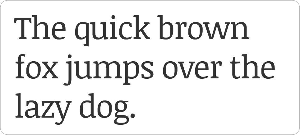
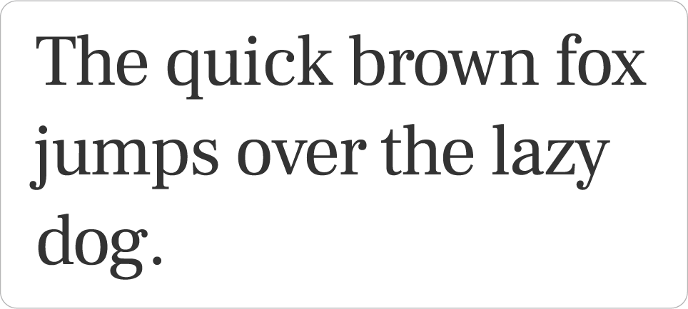
Serif vs. sans-serif fonts
A serif is a slight projection finishing off a stroke or a letter. Serif fonts populate magazines, newspapers and most books, and were used for all communication until 1812. When text emerged on screen in the early 1980’s, it was displayed on small 512 x 242-pixel screens. Serif fonts were not easily displayed, and sans-serif fonts became the industry standard for websites. Since 2012, computer companies have been able to produce a resolution of 2,880 x 1,800, allowing new guidelines for on-screen typography to emerge.

These Roman style typefaces add a traditional feel to the design, while the serifs have been known to improve legibility by pulling your eye to the right. Serif fonts have also been known to be more recognizable between similar letterforms.
Examples of serif fonts:
- Baskerville
- Goudy Old Style
- Prata
- Times New Roman
Sans-serif, meaning no serif, or without-serif fonts are known to be highly legible. The Bauhaus era influenced their growth in popularity with the overriding of the personal style of the designer in favor of “clear, concise communication of the intended message” (“A Typographic Workbook: A Primer to History, Techniques, and Artistry, 2nd edition”). These fonts are widely used for signage, maps, and smaller text. Sans-serif embodied simplicity and the use of grids.

Examples of sans-serif fonts:
- Helvetica
- Futura
- Caslon
- Gill Sans
- Brandon Gothic
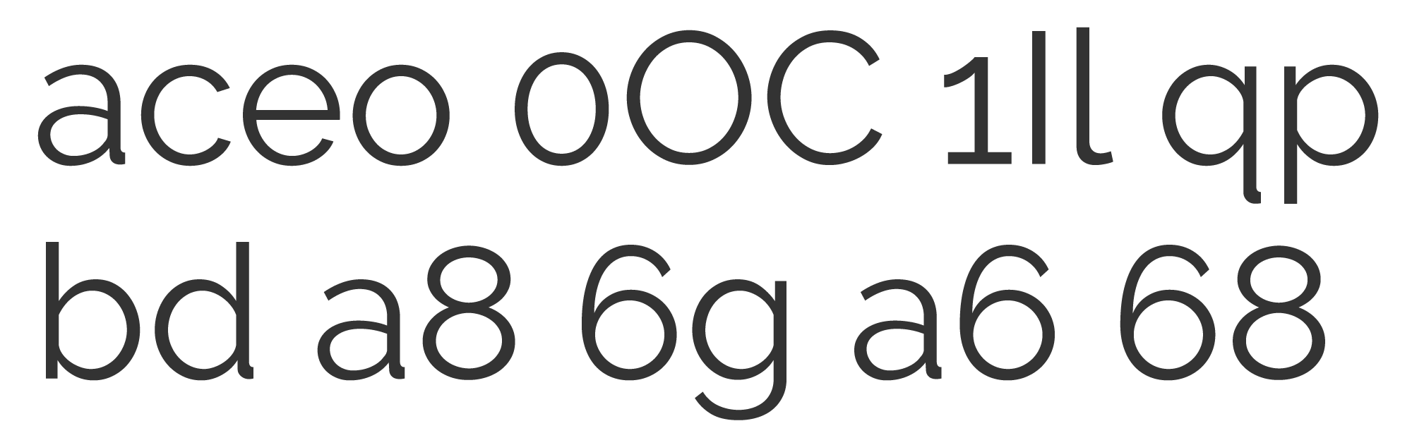
Similar & mirrored characters
A good place to start is to look for what we call mirrored characters, or characters that look very similar when placed together. This mostly occurs in sans-serif fonts in the characters o, a, e, b, d, 0, O, C, I, and l.
When mirrored characters appear together (e.g., “b” and “d”) it can be confusing, especially for those with dyslexia. In some cases, the numeral “0” and the letter “O” can be indistinguishable. This issue often comes up with email addresses.

Similar characters from the font “Poppins”
The font “Poppins” shows similarities when mirrored characters are placed together. The capital “I” and lowercase “l” are nearly identical.
Similar characters from the font “Raleway”
The font “Raleway” uses characteristics that distinguish letters by adding hooks to descenders and tails. The capital “I” and lower-case “l” are visually different.

Hooked tails differentiate similar characters in font “Raleway”.
Open counters
The counter is the enclosed portion of the letters, such as “a” and “e.” When the counter is more open, the letter can appear larger. The openness of the letter allows it to be read more easily by making it more legible.

The letters “c” and “e” have closed counters in the font “Poppins”, and open counters in the font “Nunita”.
X-height
The x-height is the measure of the baseline of a character to the top of the counter in the letterform. When the x-height is larger or the counter is more open, the font can appear larger. A small x-height or closed counter can be very difficult to read, especially at smaller sizes.

Letters appear to be larger when they have a taller x-height.
Factors that affect legibility
Font size
Making sure you start with a 13- to 16-point minimum for body copy matters. So does using incremental sizing (like em and % properties) to ensure fonts can be scalable without deteriorating, and correctly viewed on all devices.
Font weight
The weight of the font can be important because the human brain interprets linear elements positioned horizontally differently than linear elements positioned vertically. This means that vertical strokes that are too thin will not be registered correctly with the reader, causing difficulty.
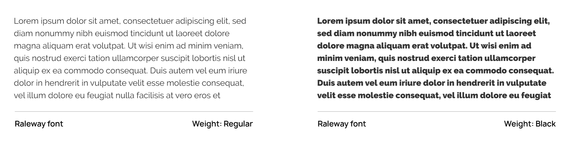
Font weight can have a significant impact on legibility and readability.
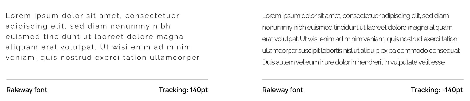
Tracking (word spacing)
When words are either too close together, or spaced too far apart, it reduces legibility. When words are tracked tightly, it is hard to decipher each word from the next. When the words are spaced too far apart, the eye cannot easily associate the current word with the next word.
Widely-spaced and tightly-tracked typography can reduce legibility and readability.
Leading (line height)
Leading (pronounced led-ing) can affect the relationship between the descenders and ascenders of the letterforms. When the leading is too tight, the letterforms may touch. Ensuring a correct ratio of space will greatly improve the readability. When longer lines of text are used, there should be a generous amount of line space to allow the eye to find its next position on the page.
Increasing the line height, or leading, can improve readability and legibility.
Line length
Line length should not exceed 80 characters, and 55 to 75 characters is optimal, depending on text size and line height. A study by Smashing Magazine suggests finding the optimal text column width by multiplying the font size by 27.8.

Multiplying the body copy size by 27.8 produces the optimal line length in pixels.
Accessible font options
Using the criteria we’ve discussed so far, we’ve selected some Google fonts that are more accessible alternatives to common web fonts. While not all accessible fonts have design in mind, the fonts we’re recommending as a starting point are professional and stylish — as well as accessible. The criteria we are aiming to achieve are:
- Distinguishing features for mirrored and similar characters
- Tall x-height
- Open counters
- Variable weights
Sans-serif fonts
Raleway
- Similar characters have distinguishing features
- Tall x-height
- Open counters
- Variable weights (18)

PT Sans
- Similar characters have distinguishing features
- Tall x-height
- Open counters
- Variable weights (3)
Alegreya Sans
- Similar characters have distinguishing features
- Tall x-height
- Open counters
- Variable weights (9)
Serif fonts

Roboto Slab
- Similar characters have distinguishing features
- Tall x-height
- Open counters
- Variable weights (4)
Libre Baskerville
- Similar characters have distinguishing features
- Tall x-height
- Open counters
- Variable weights (3)
Domine
- Similar characters have distinguishing features
- Tall x-height
- Open counters
- Variable weights (4)
Bitter
- Similar characters have distinguishing features
- Tall x-height
- Open counters
- Variable weights (19)
Noticia Text
- Similar characters have distinguishing features
- Tall x-height
- Open counters
- Variable weights (4)
Frank Ruhl
- Similar characters have distinguishing features
- Tall x-height
- Open counters
- Variable weights (7)
Color use
In web design, text is often used on a colored background, or colored text may be used on a white background. In all cases, it’s important to consider color contrast, since some color values are too similar to be used together, and sometimes too much contrast reduces readability.
Common practice is to use black text on a white background, which is the highest level of contrast, ranging from 1-21 based on screen brightness. According to Web Content Accessibility Guidelines (WCAG) 2.1, color contrast ratios should have a difference of 4.5:1 for small text, and 3:1 for larger text (18pt or greater).
If you are in the branding process, you can check all colors using this contrast checker: color-contrast-checker.deque.com. This helpful tool will suggest alternative options to meet the requirements.
Although a contrast of 21:1 (black and white) is standard for many uses such as blog posts, many people with cognitive disabilities can struggle with such high contrast. For example, black text on a bright white background can create eye strain and dizziness. A good ratio to aim for is 7:1, achieved with dark grey on a white background. Studies as far back as the late 1870s had suggested that yellow tinted papers were the easiest for reading text.
Difficulties with high contrast
People who live with cognitive disabilities and reading disabilities can struggle with black text on a white background. People who have scopic sensitivity experience rivers of white space, and letters moving on the page. This can be solved by using color-tinted lenses.
Instead of using white for a default page color, consider something slightly tinted in yellow, cyan, or magenta. Black text can be softened to a dark grey to alleviate strain on the eyes.

Text on a 2% cyan background improves readability by slightly reducing contrast.
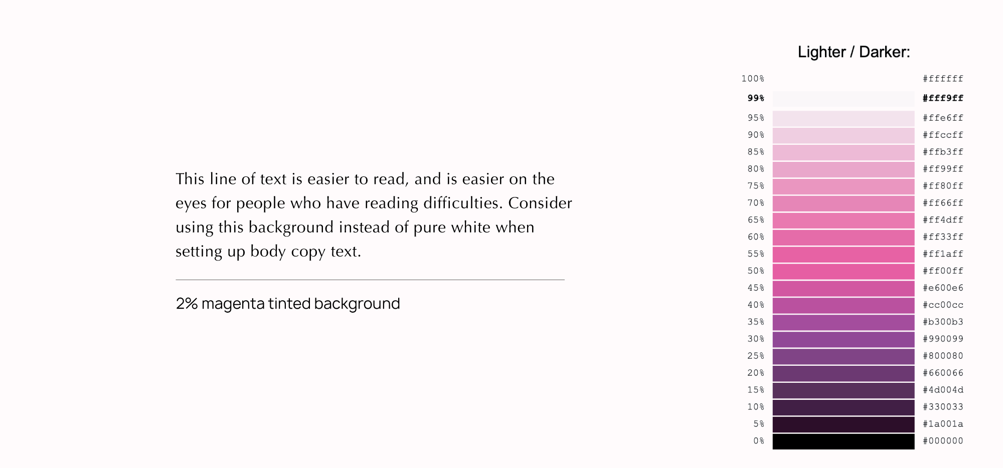
Text on a 2% magenta background improves readability by slightly reducing contrast.
The use of a color background with a 1% tint, and dark grey font (#333333) can greatly improve the user experience. You may not have even noticed that this entire blog post is set on a 1% yellow background with dark grey color text (shown below), but many readers will see the improvement. This subtle difference may not be noticeable until you encounter a higher contrast page.
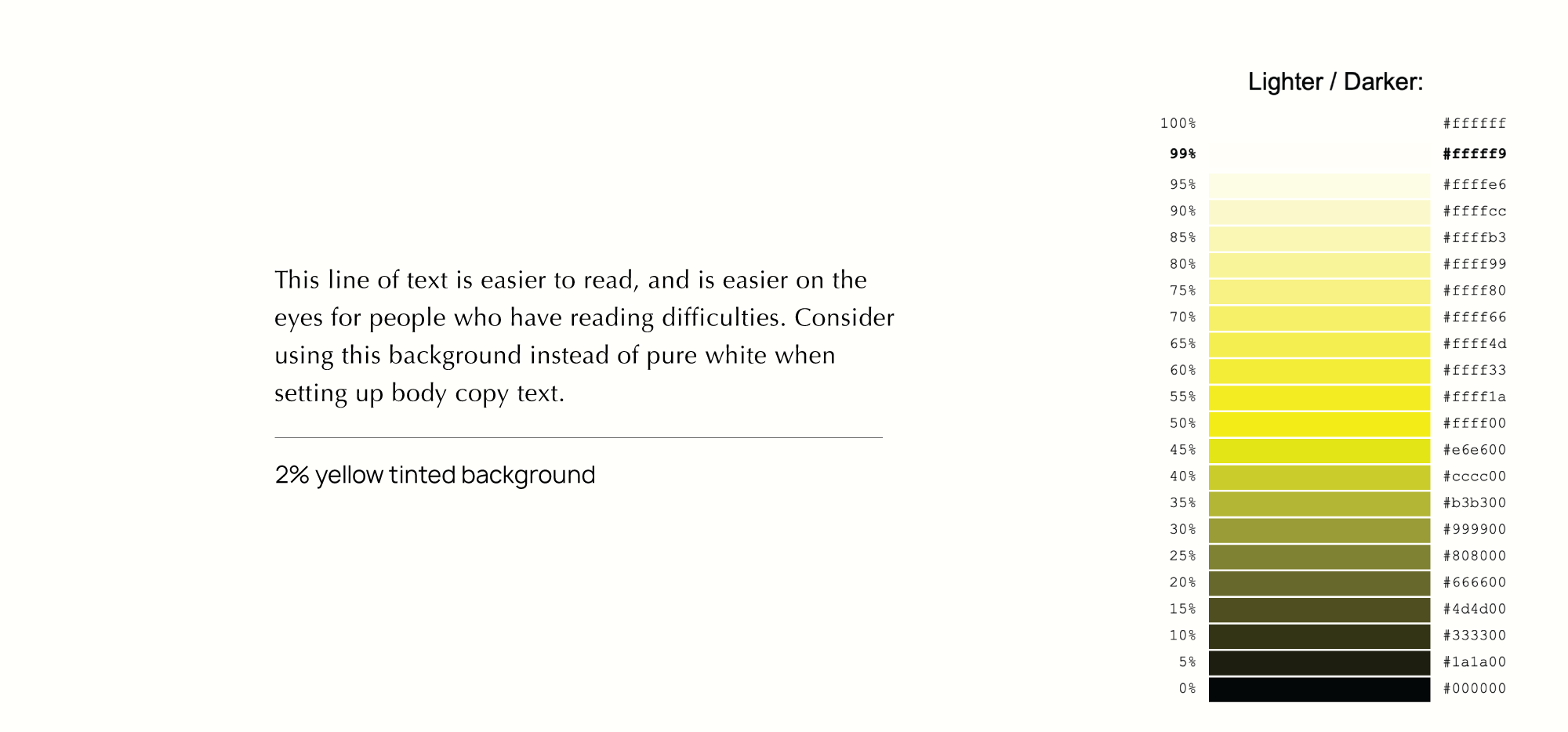
Text on a 2% yellow background improves readability by slightly reducing contrast.
Color vision & color blindness
Differences in color vision are very common, and visibility can be greatly affected by text on a colored background. Some people do not perceive shades of red, green, and yellow. As people age, blue and yellow can be harder to see. Adhering to color contrast ratio requirements can help prevent difficulties for people with color vision differences.
Hyperlinks
Hyperlinks should look like links, and nothing else. This means only link text should be underlined, and links should have minimum a 4.5:1 contrast ratio compared to surrounding non-link text. Some viewers may have difficulty seeing hyperlinks on a page due to their color. The most accessible websites allow users to choose the color of hyperlinks and visited links. Web developers can use CSS to alter the appearance of the underline in links, to help users differentiate information on the page.
Be sure to keep your link names informative. When creating buttons and hyperlinks, the link needs to tell the viewer where they will navigate to.

Descriptive buttons are more helpful to website visitors, including those who use screen reading software.
When using CSS to apply visual effects to links such as a:hover, be sure to include a:focus as well to ensure effects are applied when users navigate or tab to the link using a keyboard.
Using text in images
Featuring text in an image has been a common practice in design for many years, although it also poses accessibility issues. A good practice is to avoid including important information in images, and always using HTML alt tags to properly describe your image — which allows screen reading software to describe images to website visitors. Rather than using text in a .jpeg or .png file, you should use CSS to style and format the content. This also allows screen readers to differentiate the text from the image, for the benefit of site visitors.
When an image is used as a link, the HTML alt text performs the function of the button or link text. When this happens the alt text must act as the button text.
Using text on an image can also become an issue for legibility. To increase legibility, make sure to include a transparency or drop shadow as shown below:
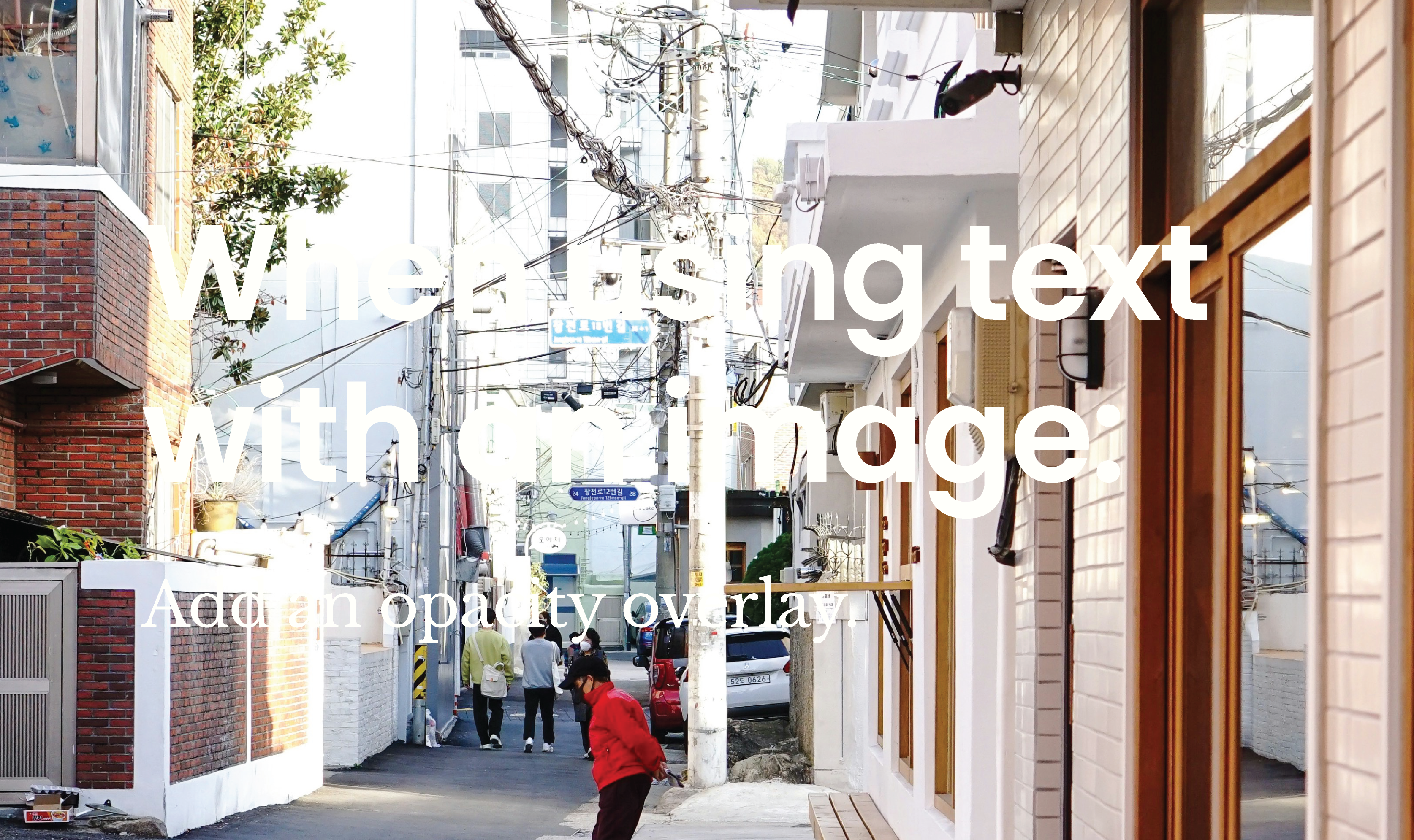
Text overlaid on images with very low contrast is hard to read.
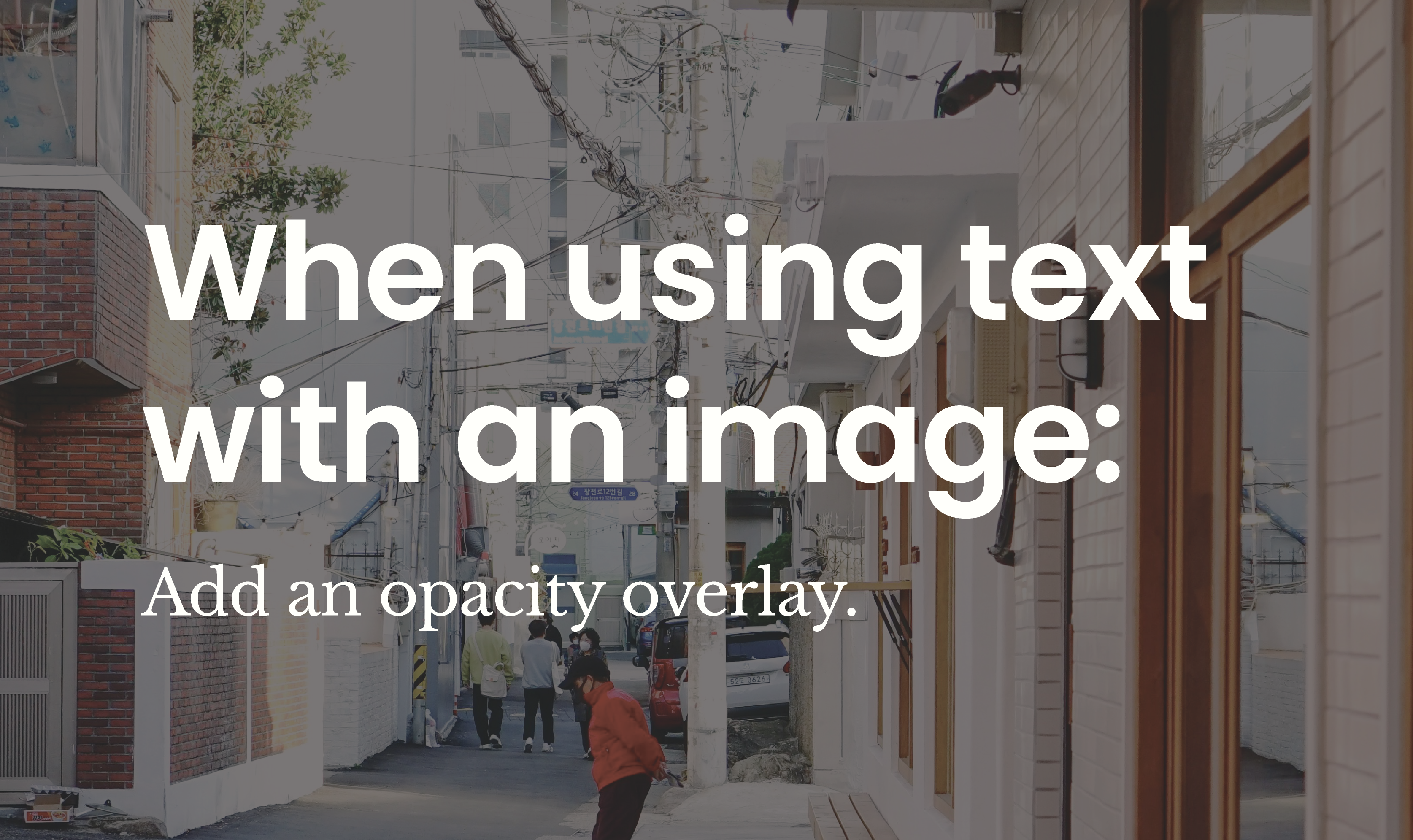
Text overlaid on images is easier to read with a high contrast opacity overlay.
HTML hierarchy and screen readers
Using HTML correctly can help users get a sense of page structure and organization. Body copy ranges from 13pt to 16pt, and headings range from 18pt to 29pt.
To determine the size for your headings, multiply the body copy size by 2. For example, 16pt body copy multiplied by 2 equals a 32pt heading.

Setting a heading at two times the size of the body copy makes both the headings and body copy easy to read in relation to one another.
When headings and content are coded in order, screen reader users can navigate the page correctly. This means using headings in the order of importance, starting with H1, H2, H3, H4, and H5 — without skipping any levels. This setup works with screen reader technology to give users the ability to listen to a list of headings and skip to a desired heading or point on the page. It’s also an important principle to follow for search engine optimization (SEO). Simply changing the text face to bold isn’t the same as using a heading tag. When using H tags, be sure to use H1 only once to begin the page — and make sure it matches the title of the page.
Responsive design
A responsive website means that content will adjust as the screen adjusts. If a user zooms in to 400%, the structure will respond to the nearest size device setting. There is no need to scroll left or right, which helps users with limited dexterity. When mobile and other screen size have been considered, you can ensure that the content will view with correct spacing, font sizes and button and link size.
The new Calibri font design: Aptos font
How the redesign features traits of an accessible font
The redesign of the windows font, Calibri, is an indicator that there is need for accessible typography. After reviewing the traits and characteristics that make a font accessible, we can clearly see what changes were made to improve the legibility of this sans-serif Aptos font.
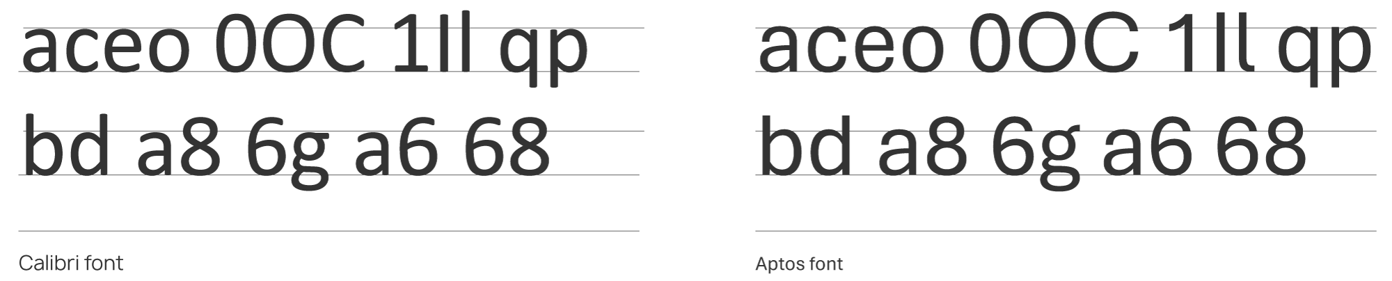
Calibri font has similar characters and a smaller x-height compared to the new Aptos font, which has improved similar characters and a taller x-height.
X-height
In comparison, the two fonts look very close in height, but Aptos font comes in just a bit taller making it appear larger on the screen. Some feedback from users is that it takes up a bit more space than its predecessor, Calibri font.
Open counters
We feel this is a bit of a step backwards, because Aptos font has reduced the openness in the counters and created more similarities between the “c” and “e” characters. Since the x-height has increased, we do notice that the bowl and counter areas are indeed larger.
Mirrored characters have distinguishing features
We can see where Aptos has made an adjustment when the capital “I” and lowercase “l” are placed together. We would like to see features that differentiate the “d” and “b” a bit more.
Accessible fonts for law firm websites are just one aspect of creating an inclusive and user-friendly online experience. At FLM Design, we specialize in building websites that meet WCAG, ADA, and AODA accessibility standards, ensuring all users—regardless of ability—can navigate, read, and interact with content effectively. From typography choices to intuitive layouts and compliant design elements, we focus on usability, readability, and legal industry best practices. By prioritizing accessibility, law firms can enhance their digital presence, improve client engagement, and demonstrate a commitment to inclusivity.